
Chiseiko Essential Swatches Pro
Advanced Styling
Pro module. Requires Chiseiko Essential Swatches Pro with an active license. Enable the "Advanced Styling" module at WooCommerce → Chiseiko Essential Swatches Pro → Modules.
What Does This Module Add?
The Advanced Styling module gives you several extra visual customization tools:
| Feature | What it Does |
|---|---|
| Swatch Shapes | Change swatches from circles to squares, pills, or a custom corner radius |
| Multi-Stop Color Gradients | Build a gradient with up to 5 color stops on a single swatch — great for heather, ombré, or multi-tone products |
| Dual & Multi-Color Modes | Render a swatch as a single color, a dual-color diagonal split, or a multi-stop gradient |
| Custom Border Radius | When using "Custom" shape, set the exact roundness of corners |
| OOS Display Mode | Choose how out-of-stock swatches appear across your whole store: crossed-out, blurred, or hidden |
| Custom CSS per swatch | Write CSS that applies only to one specific swatch term — no theme editing needed |
| Per-product overrides | Override tooltip position, tooltip delay, and OOS mode on individual products |
About tooltips: Hover tooltips are powered by the separate Swatch Tooltips module, not Advanced Styling — but its settings live alongside these on the Display Settings tab (in its own Swatch Tooltips card), so they are documented together below. Enable the Swatch Tooltips module on the Modules tab to use them.
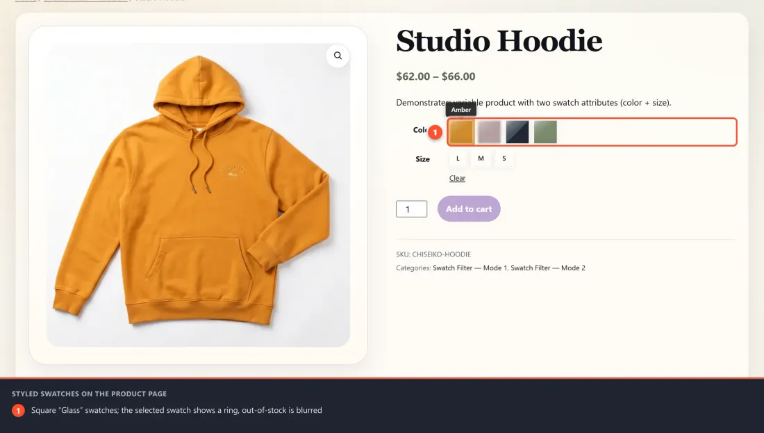
Here is the result on a product page — square "Glass"-style swatches with a selected ring and a blurred out-of-stock option:
Enabling the Module
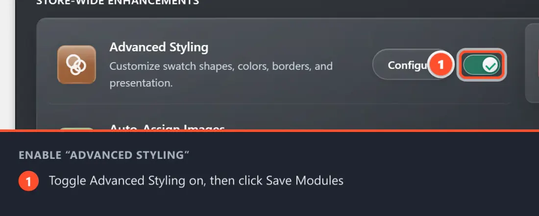
- Go to WooCommerce → Chiseiko Essential Swatches Pro → Modules.
- Check the box next to Advanced Styling.
- Click Save Modules.
Style Presets
Before you fine-tune individual swatches, you can set the overall look and feel of every swatch in your store with a single choice. The Style Preset control lives on the WooCommerce → Chiseiko Essential Swatches Pro → Display Settings tab, in the Appearance card. It is a global Pro setting — it applies to swatches everywhere (product pages, shop and archive grids, quick view, the sticky bar, and the filter widget), and it is available whenever Pro is licensed.
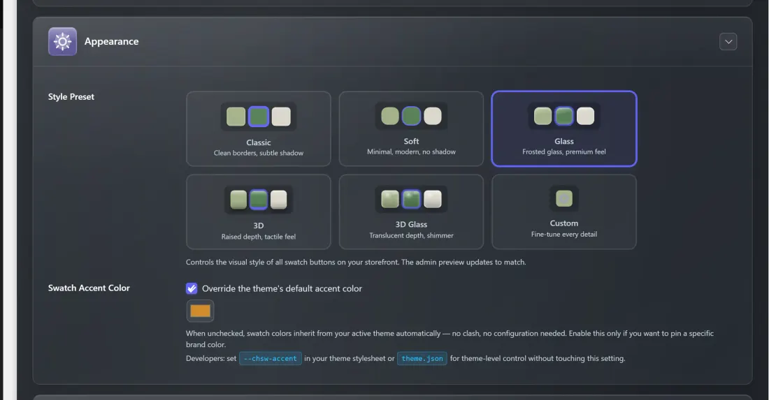
Pick one of six presets:
| Preset | Look |
|---|---|
| Classic | Clean borders with a subtle shadow — the default. |
| Soft | Minimal and modern, with no shadow. |
| Glass | A frosted-glass effect for a premium feel. |
| 3D | Raised, tactile depth. |
| 3D Glass | Translucent depth with a soft shimmer. |
| Custom | Unlocks the fine-tuning controls below so you can build your own look. |
Each preset shows a small live preview of demo swatches in the admin so you can compare them before saving.
Custom preset controls
Choosing Custom reveals a set of sliders and dropdowns that define your own swatch style:
| Control | Range | Default |
|---|---|---|
| Border Width | 0–4 px | 2 px |
| Corner Radius | 0–50 px | 6 px |
| Shadow | None / Subtle / Medium / Strong | Subtle |
| Hover Scale | 100–120% | 108% |
| Transition Speed | 100–500 ms | 200 ms |
- What it affects: the border, corner rounding, shadow depth, hover grow effect, and animation speed of every swatch button. Corner Radius interacts with the per-term Swatch Shape below — a circular shape always wins over a radius value.
- Only the active preset's styles are loaded on the storefront, so switching presets never adds unused CSS weight.
Part 1 — Global Styling Defaults
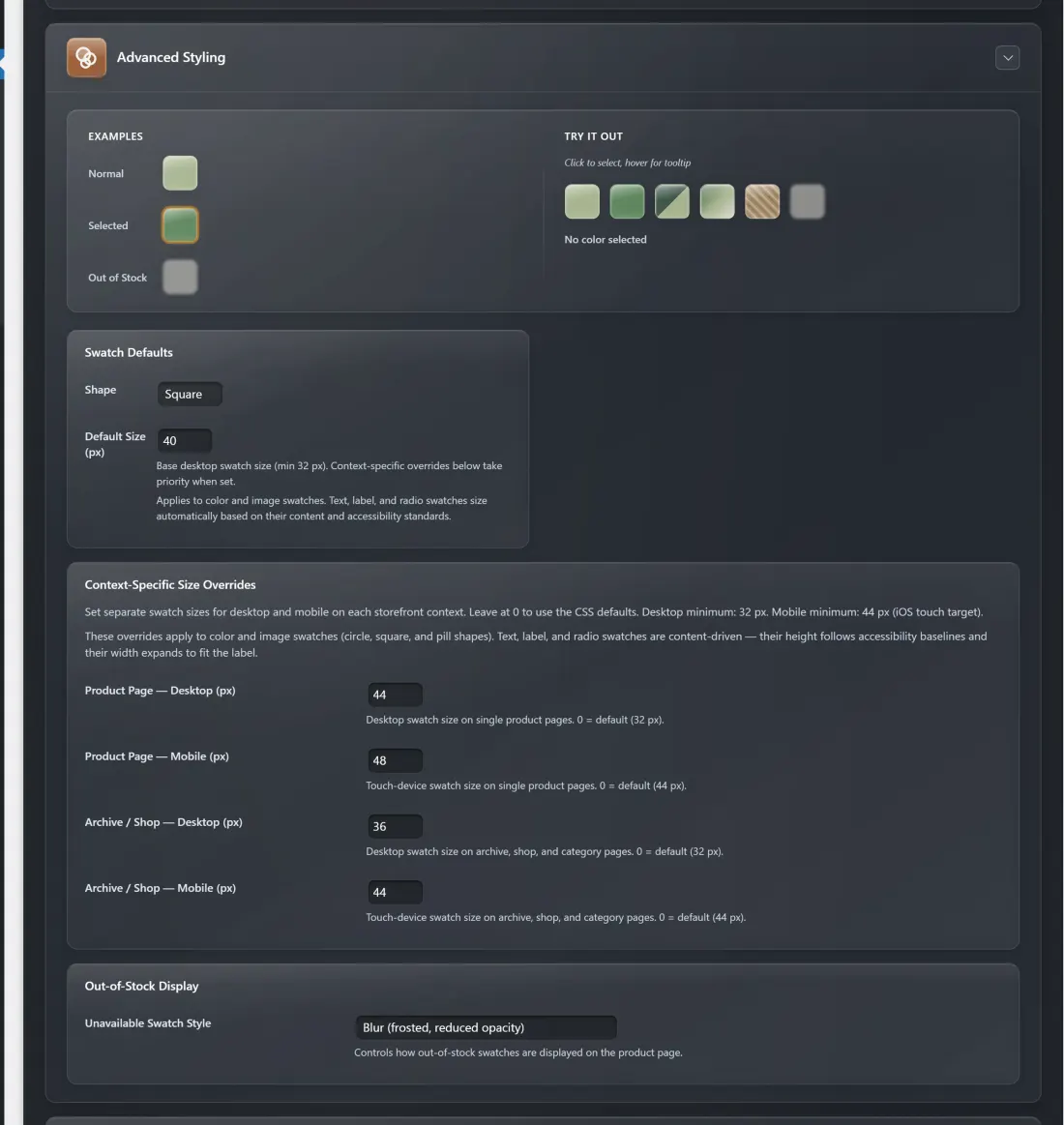
Go to WooCommerce → Chiseiko Essential Swatches Pro → Display Settings tab to set store-wide defaults. Open the Advanced Styling card.
These settings apply to all swatches unless you override them on a per-term basis (covered in Part 2 below).
Tooltips Section (Swatch Tooltips module)
These settings belong to the separate Swatch Tooltips module and appear in their own Swatch Tooltips card on the Display Settings tab. The in-admin field labels are simply Position and Delay (ms).
Default Tooltip Position
A tooltip is a small pop-up bubble that appears when a customer hovers their mouse over a swatch, showing the swatch label (e.g., "Rose Blush").
Use this setting to choose where the bubble appears relative to the swatch:
| Option | Tooltip Appears |
|---|---|
| Top | Above the swatch |
| Bottom | Below the swatch |
| Left | To the left of the swatch |
| Right | To the right of the swatch |
Choose the position that best fits your page layout. Top works well in most cases.
Tooltip Delay (ms)
This controls how quickly the tooltip appears after a customer's mouse hovers over a swatch.
- 0 = Tooltip appears instantly
- 300 (default) = A very small delay (300 milliseconds — barely noticeable but prevents flashing when mousing across multiple swatches quickly)
- 1000 = A 1-second delay before the tooltip appears
You can enter any value from 0 to a maximum of 2000 ms. Most stores work best with 300. Increase the delay if you find tooltips feel intrusive.
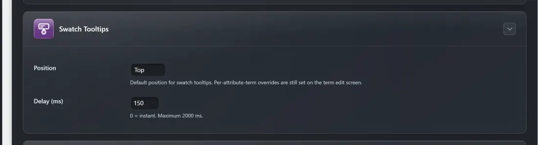
Good to know: Tooltips appear on single product pages only. On the shop/category grid, swatches are shown as a quick preview strip and tooltips are not loaded there — this keeps those pages fast.
Per-term position override. The Position above is the store-wide default. If one attribute wants its tooltip on a different side, you can override the position for an individual attribute term on its edit screen (Products → Attributes → Configure terms → Edit), in the same term fields where you set that term's shape and color mode. Leave it blank to inherit the global Position.
After making changes, click Save Display Settings.
Swatch Defaults Section
Default Swatch Shape
Choose the shape used for all swatches in your store:
| Shape | Appearance |
|---|---|
| Circle (default) | Round swatch buttons |
| Square | Square buttons with no rounded corners |
| Pill | Fully rounded on the left and right sides (like a capsule) — works especially well for text/size swatches |
The global default offers Circle, Square, and Pill. (A fourth shape, Custom, with a custom corner radius is available per term on the term edit screen — see Part 2.) Select your preferred default and click Save Display Settings.
Tip: "Circle" looks great for single-color swatches. "Pill" or "Square" works better for text-based size swatches. You can mix shapes by overriding the shape per attribute term (see Part 2).
Default Size (px)
This controls the width and height of every swatch button in pixels (it applies to color and image swatches; text, label, and radio swatches size automatically to their content).
- Minimum: 32 px
- Maximum: 200 px
- Default: 32 px
Enter a number in the field and click Save Display Settings. Changes will apply across your whole store.
Tip: 32–40 px is a comfortable size that balances visibility with a clean layout. Going well above 50 px makes swatches very large — useful only if you have a specific design reason.
OOS Display Mode
This setting controls how out-of-stock swatches look across your whole store. It applies to:
- Variation swatches on product pages (when a color/size is sold out)
- Linked simple product swatches (when a product in the group is out of stock)
Choose from three display modes:
| Mode | What Customers See |
|---|---|
| Cross-out (default) | The swatch appears at reduced opacity with a diagonal line drawn through it — clearly marking it unavailable while still showing the color |
| Blur | The swatch is blurred and desaturated — useful if you want a softer "faded out" look |
| Hide | The swatch is completely removed from view — customers only see in-stock options |
To change the OOS Display Mode:
- Go to WooCommerce → Chiseiko Essential Swatches Pro → Display Settings.
- Find the Out-of-Stock Display card and its Unavailable Swatch Style dropdown.
- Select your preferred mode.
- Click Save Display Settings.
Tip: "Cross-out" is recommended for most stores. It lets customers see what colors exist (even when out of stock) and understand the full range of options. "Hide" is better for stores where you never want to show unavailable products at all.
Per-product override: You can override this setting on individual products — for example, hiding OOS swatches on one product while crossing them out on others. See Per-Product Overrides below.
Part 2 — Per-Term Styling Overrides
You can also override the global settings on a per-term basis. This means, for example, you could use circles for your Color attribute but pills for your Size attribute.
These options appear directly on the term edit screen — the same place you set swatch colors and images in Chapter 2.
How to Access Per-Term Styling
- Go to Products → Attributes.
- Click Configure terms on the attribute you want to adjust.
- Find the term you want to edit and click Edit under its name.
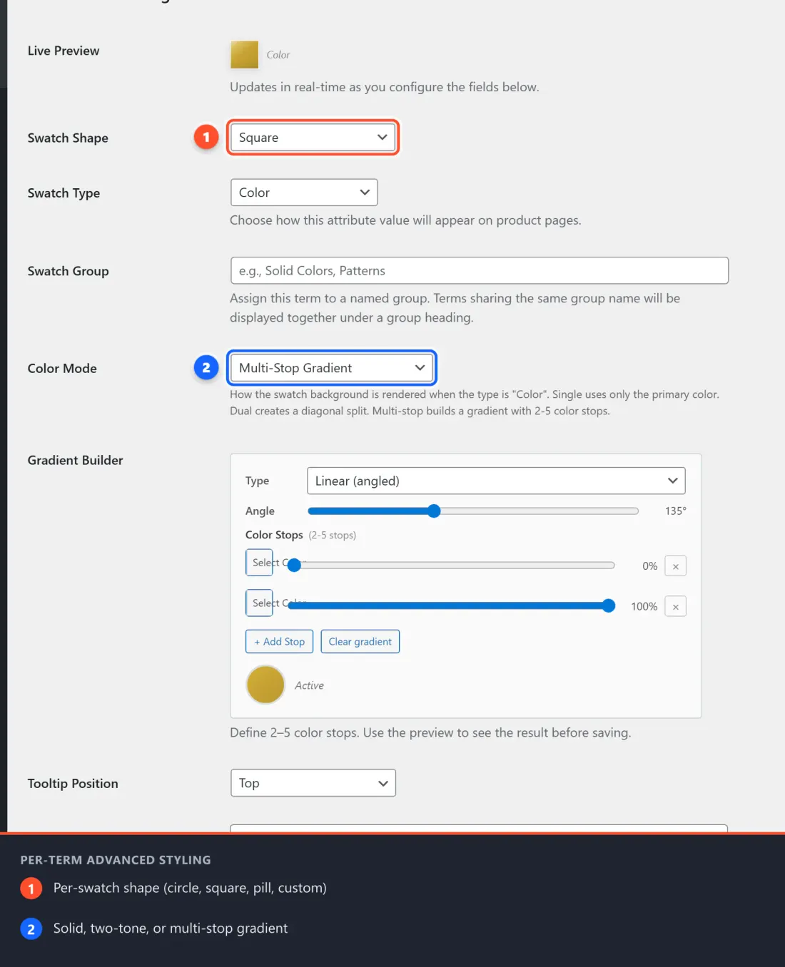
- With the Advanced Styling module active, you will see additional fields on the edit screen:
Per-Term: Swatch Shape
An extra Swatch Shape dropdown appears on each term's edit screen. You can:
- Leave it at "Use global default" to follow the setting you configured above
- Or choose a specific shape just for this term
Example use case: Your "Color" terms use circles, but you want your "Shade Intensity" (Light / Medium / Dark) terms to appear as pills. Set Shade Intensity terms to "Pill" in their edit screens.
Per-Term: Custom Border Radius
This field only appears when you select Custom as the swatch shape.
- Enter a number between 0 (sharp square corners) and 50 (fully round).
- The number represents a percentage of the swatch's half-size.
- 0 = perfectly square corners
- 25 = moderately rounded corners
- 50 = fully circular (same as the "Circle" shape)
Per-Term: Multi-Stop Gradient Builder
This is one of the most powerful customization features in the Advanced Styling module. Instead of a plain flat color, you can make a swatch display a gradient — a smooth blend of two to five colors. This is great for:
- Heather / marled yarn colors (a grey blended with blue, for example)
- Ombré or tonal shades (dark at the top, light at the bottom)
- Split colors (half one color, half another — like a two-tone range)
- Any product color that cannot be captured in a single flat color
The gradient builder only appears on terms that have Swatch Type: Color assigned.
How to Open the Gradient Builder
- Go to Products → Attributes.
- Click Configure terms on the attribute you want (e.g., "Color").
- Find the term you want to add a gradient to (e.g., "Heather Sage") and click Edit.
- Find the Color Mode dropdown. It offers three options:
- Single Color — a plain flat color (the default)
- Dual Color (diagonal split) — a 50/50 diagonal split between two colors, using the Swatch Color and a Second Color picker
- Multi-Stop Gradient — the full gradient builder described below Choose Multi-Stop Gradient. The Gradient Builder appears directly below it.
Step-by-Step: Building a Gradient
Here is how to create a gradient from scratch:
Step 1 — Choose the gradient type
You will see a Type dropdown with three options:
| Type | What it Does | Best For |
|---|---|---|
| Linear (angled) | Colors blend smoothly from one direction to another (e.g., left to right, top to bottom, or any angle) | Ombré, soft fades, multi-tone transitions |
| Radial (center outward) | Colors radiate outward from the center of the swatch like rings | Highlight effects, spotlight-style blends |
| Diagonal split (2-tone) | A hard diagonal line divides the swatch exactly 50/50 between the first and last color. No blending — clear and crisp edge. | Two-tone products, heather colors, contrast pairs |
Select the type that best fits your product color. If you are unsure, Linear (angled) is the safest starting point.
Step 2 — (For Linear only) Set the angle
If you chose Linear (angled), an Angle slider appears. This controls the direction the gradient flows:
| Angle | Direction |
|---|---|
| 0° | Bottom to top |
| 90° | Left to right |
| 135° | Top-left to bottom-right (diagonal — the default) |
| 180° | Top to bottom |
| 270° | Right to left |
Drag the slider to any angle between 0° and 360° (it defaults to 135°). Most gradients look best at 135° (diagonal) or 180° (top to bottom).
Step 3 — Set your color stops
A color stop is one of the individual colors in the gradient. By default you start with two color pickers (stop 1 and stop 2).
- Click the colored swatch next to Stop 1. A color picker will pop up — choose your first color, or type the hex code directly.
- Click the colored swatch next to Stop 2 and select your second color.
- Look at the live preview circle to the right — it updates in real time as you make changes, so you can see exactly what the swatch will look like on your store.
Step 4 — (Optional) Add more color stops
You can add up to 5 stops total. This lets you create richer, more detailed gradients.
To add another stop:
- Click the + Add Stop button below the existing stops.
- A new color picker appears. Click it and choose the color for that position in the gradient.
- Stops go in order from beginning to end of the gradient — so Stop 1 is the start, Stop 2 is next, and so on up to Stop 5.
- Watch the live preview update as you add each stop.
To remove a stop you no longer need, click the ✕ Remove button next to it. You must always keep at least 2 stops.
Step 5 — Save your gradient
Once you are happy with what you see in the live preview, click Update at the bottom of the term edit screen. The gradient is now saved and will appear on your product pages.
Clearing a Gradient
If you want to go back to a plain flat color:
- Scroll to the Gradient Builder on the term edit screen.
- Click the Clear gradient button.
- Click Update.
The swatch will return to using the standard flat color from the Swatch Color field.
Gradient Examples
| Product Color | Type | Stops |
|---|---|---|
| Heather Sage (grey-green blend) | Linear 135° | #8A9A5B (sage) → #B0B0A0 (warm grey) |
| Gold Ombré | Linear 180° | #dfc252 → #d4af37 → #b8952e |
| Rose-Ivory Split | Split | #e8b4b8 (rose) → #f5f0e8 (ivory) |
| Ocean Depths | Radial | #1a3a5c → #2e6699 → #7fb6d4 → #c7e4f5 |
Gradient Builder FAQs
Q: I don't see the Gradient Builder on the term edit screen.
A: Make sure the Advanced Styling module is enabled at WooCommerce → Chiseiko Essential Swatches Pro → Modules. Also confirm the term's Swatch Type is set to Color — the gradient builder only appears for color-type swatches.
Q: My gradient saved but the swatch still shows as a flat color on the product page.
A: Clear your browser cache and any caching plugin on your site. Old cached CSS may be overriding the new gradient. Also confirm you clicked Update (not just navigated away) after setting the gradient.
Q: Can I use a gradient on an image swatch?
A: No. Gradient only applies to Color type swatches. Image swatches always show the image you uploaded.
Q: The live preview looks fine but the swatch on the actual product page looks different.
A: This can happen if your theme has custom CSS that affects swatch elements. Try clearing caches first. If it persists, a developer can inspect the element in the browser and identify any conflicting CSS rules.
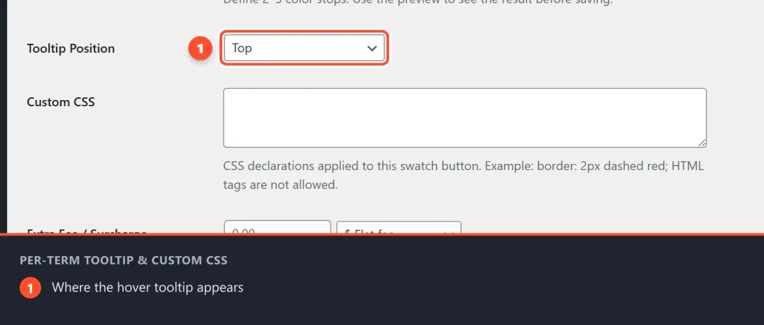
Per-Term: Tooltip Position Override
By default, tooltips appear in the position you set in the global settings. You can override this per term if needed.
Choose from:
- Use global default — follows the global tooltip position setting
- Top / Bottom / Left / Right — overrides it for this one term
This is rarely needed but useful if you have a swatch group near the edge of the screen where the default tooltip direction would go off screen.
Per-Term: Custom CSS
This field lets you write CSS that applies only to this one swatch. You do not need to edit your theme or add rules to a custom CSS file.
When would you use this?
- Add a special glow or border to a featured swatch (e.g., "New!")
- Increase the size of one specific swatch
- Apply a box-shadow effect to make a light-colored swatch stand out
How to add custom CSS to a term:
- Go to Products → Attributes.
- Click Configure terms on the attribute you want.
- Click Edit next to the term.
- Scroll to the Custom Swatch CSS field.
- Type your CSS rules. The CSS is automatically scoped to that swatch only, so you do not need to worry about affecting other swatches.
- Click Update.
Example:
box-shadow: 0 0 0 3px #D4AF37;
border: 2px solid #D4AF37;
This adds a gold ring around the swatch — useful for highlighting a "signature" or featured color.
Note: Only CSS property/value pairs are needed — no selector, no curly braces. The plugin wraps your CSS in the correct selector automatically. HTML tags are stripped from this field for security.
Per-Product Overrides
You can override three Advanced Styling settings on a per-product basis — useful when one product needs different behavior than the rest of your store.
These fields appear on the individual product edit screen, under Product data → Swatches tab, in the Advanced Settings section.
| Field | What it Does |
|---|---|
| Tooltip Position | Overrides the global tooltip position for this product only |
| Tooltip Delay (ms) | Overrides the global tooltip hover delay for this product only |
| Unavailable Swatch Style | Overrides the global OOS display mode for this product only |
To set a per-product override:
- Open the product in the editor.
- Scroll to Product data and click the Swatches tab.
- Open the Advanced Settings section.
- Change any field from "Use global default" to your preferred value.
- Click Update to save the product.
Leaving all three fields at "Use global default" stores no extra data and has zero effect on performance.
Example use case: Your store uses "Cross-out" for all products, but for one luxury product you want to hide OOS swatches entirely so the page always looks clean. Set "Unavailable Swatch Style" to "Hide" on just that product.
Tips and Ideas
- Mix shapes across attributes. Set colors to "Circle", sizes to "Pill", and it gives your product pages a professional layered look.
- Keep sizes consistent within an attribute. Mixing swatch sizes within one attribute (e.g., some 30 px and some 50 px) looks unintentional. Use the same size per attribute.
- Tooltips are especially valuable for image swatches, where the image alone may not make the color name obvious. Enabling tooltips means customers always know what they're hovering over.
- Gradients look best at 36 px or larger. At very small sizes (below 28 px), subtle gradients are hard to distinguish. If you use small swatches, stick to high-contrast stop pairs or the "Split" type which gives a clean, sharp divide.
- Use the live preview circle to check your gradient before saving. What you see in the preview is exactly how it will appear on the product page.
Frequently Asked Questions
Q: I changed the shape but nothing changed on my site. A: Clear your browser cache and your site's caching plugin (WP Super Cache, W3 Total Cache, WP Rocket, etc.) and then check again.
Q: Can I make some terms on the same attribute have different shapes? A: Yes! Each term's shape is individually configurable. Set the shape to what you want on each term's edit screen.
Q: The tooltip text shows the term's slug (like "rose-blush") instead of the name ("Rose Blush"). A: This always shows the term's name, not its slug. If you see a slug-like string, it is because the term's name was saved in lowercase with hyphens. Edit the term and update the Name field to the properly capitalized version.
Q: Where is the "Custom" border-radius field? I chose "Custom" but don't see it. A: Make sure the Advanced Styling module is enabled and that you have clicked "Update" after selecting "Custom" as the shape — the radius field appears below the shape dropdown, and the page may need to refresh once.