
Chiseiko Essential Swatches Pro
Sticky Add-to-Cart Bar
Pro module. Requires Chiseiko Essential Swatches Pro with an active license. Enable the "Sticky Add-to-Cart Bar" module at WooCommerce → Chiseiko Essential Swatches Pro → Modules.
What Does This Module Do?
On a product page, the Add to cart button usually sits near the top, next to the product image and swatches. As soon as a customer scrolls down to read the description, reviews, or shipping details, that button disappears off the top of the screen. To buy, they have to scroll all the way back up.
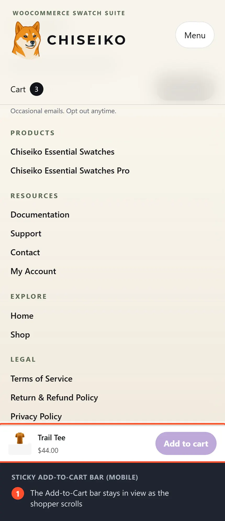
The Sticky Add-to-Cart Bar fixes that. When the main Add to cart button scrolls out of view, a slim bar slides in along the bottom of the screen. That bar carries a copy of the product title, the price, and a working Add to cart button — so the customer can buy at any point without scrolling back up.
When the customer scrolls back up far enough that the original button returns to the screen, the bar quietly slides away again.
Why this is useful:
- Fewer abandoned purchases — the buy button is always within reach.
- Better on phones especially — mobile product pages are long, so the original button vanishes quickly.
- No extra clicks — it is the same Add to cart action customers already know, just always visible.
The bar is built with accessibility in mind. While it is hidden it ignores clicks and keyboard focus entirely, and when a customer tabs through the page the browser automatically scrolls items above the bar so nothing gets covered. If a visitor has "reduce motion" turned on in their device settings, the slide-in animation is skipped and the bar simply appears.
Enabling the Module
- Go to WooCommerce → Chiseiko Essential Swatches Pro → Modules.
- Check the box next to Sticky Add-to-Cart Bar.
- Click Save Modules.
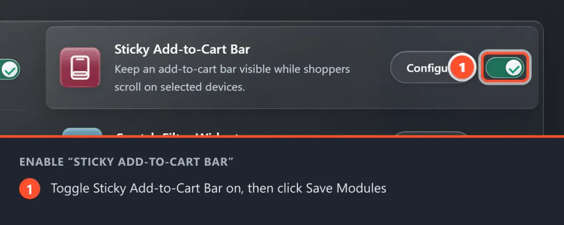
Once enabled, the bar works automatically on your product pages — there is nothing to add to individual products.
Configuring the Sticky Bar
Go to WooCommerce → Chiseiko Essential Swatches Pro → Display Settings.
Scroll to the Sticky Add-to-Cart Bar card. This module has a single setting.
If the card shows a message asking you to enable the module first, go back to the Modules tab and turn on Sticky Add-to-Cart Bar — the setting only appears once the module is enabled.
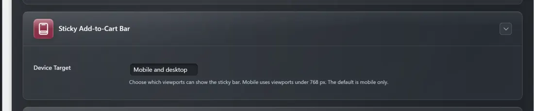
Setting: Device Target
What it does: Chooses which screen sizes are allowed to show the sticky bar. The available choices are:
- Mobile only — the bar appears on phones and small screens (viewports under 768 px wide) only.
- Desktop only — the bar appears on larger screens (768 px and wider) only.
- Mobile and desktop — the bar appears on every screen size.
Default: Mobile only. (Mobile product pages are the longest, so this is where the always-visible button helps most.)
How to adjust it:
- Go to WooCommerce → Chiseiko Essential Swatches Pro → Display Settings.
- In the Sticky Add-to-Cart Bar card, open the Device Target dropdown.
- Pick Mobile only, Desktop only, or Mobile and desktop.
- Click Save Display Settings.
What the Customer Experience Looks Like
- A customer opens one of your product pages on a device that matches your Device Target setting.
- At the top of the page they see the product image, swatches, price, and the normal Add to cart button. No sticky bar is showing yet.
- They start scrolling down to read the description or reviews. As the original Add to cart button slides off the top of the screen, a slim bar slides up from the bottom of the screen.
- The bar shows the product title, the price, and a working Add to cart button — a copy of the one they just scrolled past.
- The customer can tap that button at any point to add the product to their cart, without scrolling back up.
- When they scroll back up far enough that the original button returns to the screen, the bar slides back down and disappears.
The button in the bar behaves exactly like the main one, including with your swatch selections — so the right variation is added to the cart.
Tips for Best Results
- Start with Mobile only. This is the default and the most common choice, because mobile product pages are the longest and benefit the most. Try it on a phone first.
- Consider "Mobile and desktop" for long desktop pages. If your product pages have lots of content (long descriptions, big review sections, tabs), the original button disappears on desktop too — turning the bar on for all devices keeps the buy button handy there as well.
- Check it on a real phone, not just a narrow browser window. The mobile breakpoint is screens under 768 px wide, so testing on an actual device gives you the truest picture.
- Make sure your theme footer leaves room. The bar sits at the very bottom of the screen. If your theme has its own floating element down there, scroll through a product page once to confirm nothing overlaps awkwardly.
Frequently Asked Questions
Q: Where does the sticky bar appear — does it cover my whole site? A: No. It only appears on single product pages, and only on the device sizes you choose in Device Target. Other pages (shop, cart, checkout, blog) are unaffected.
Q: I enabled the module but I don't see the bar. What's wrong? A: The bar only slides in after you scroll down far enough that the main Add to cart button leaves the screen. On a short product page it may never need to appear. Also check that the page you are viewing matches your Device Target setting (the default is mobile only, so on a desktop you would need to switch to "Desktop only" or "Mobile and desktop").
Q: Does the bar work with my swatches? A: Yes. The Add to cart button in the bar is a copy of your real one, so the variation a customer has selected through the swatches is the variation that gets added to the cart.
Q: Will it get in the way of customers using a keyboard or screen reader? A: No. While the bar is hidden it ignores clicks and keyboard focus completely, and when a visitor tabs through the page the browser automatically keeps focused items above the bar so nothing is hidden behind it.
Q: A customer has "reduce motion" turned on — what do they see? A: The slide-in animation is skipped for them. The bar simply appears and disappears instantly instead of sliding, which is the accessible, motion-safe behavior.