
Chiseiko Essential Swatches
Creating Attributes & Swatches
This is where the magic happens. In this chapter you will learn how to create product attributes (like "Color" or "Size") and assign a color or image to each option so it appears as a visual swatch on your store.
Understanding Attributes and Terms
Before we start, here are two words that WooCommerce uses that you need to know:
- Attribute — a feature that a product can vary by. Examples: Color, Size, Material, Scent.
- Term — one specific option within an attribute. For the "Color" attribute, terms might be Red, Blue, Green, Black.
When you configure a swatch, you are assigning a color or image to a term (for example, making "Red" display as a red circle).
Step 1 — Go to the Attributes Screen
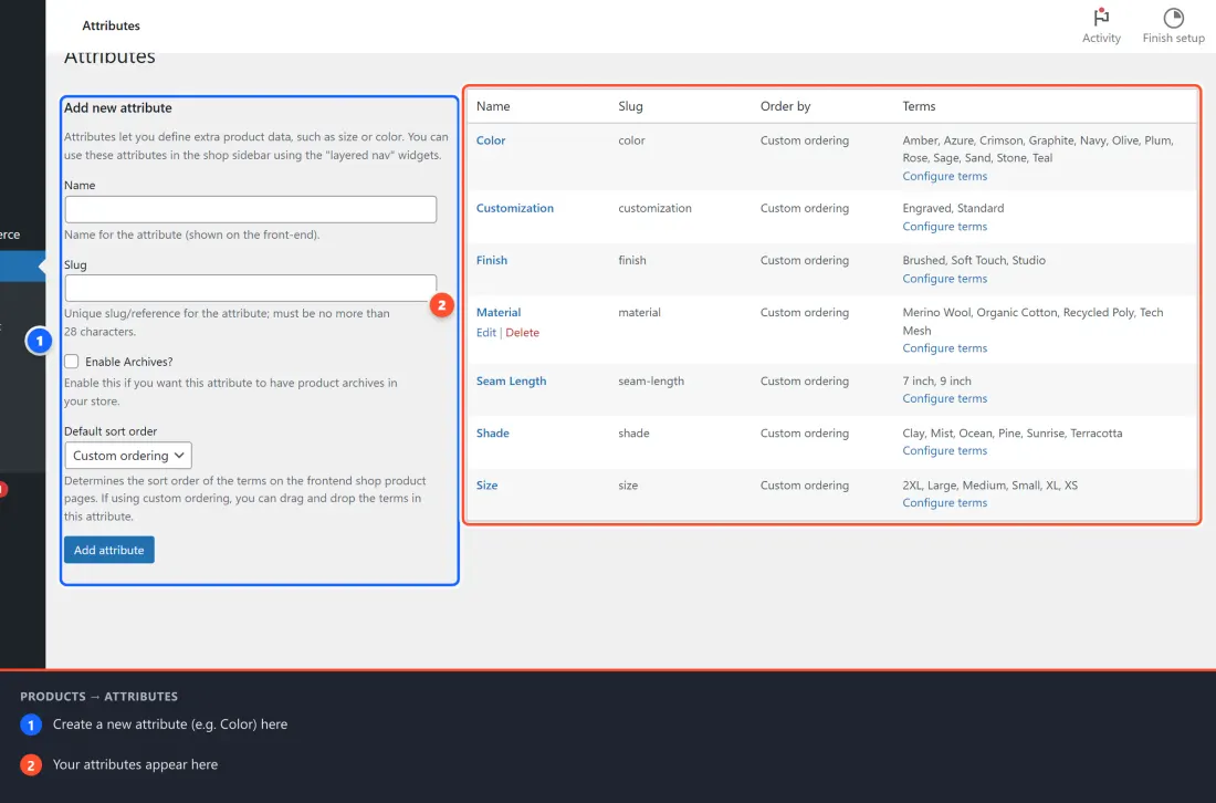
- In your WordPress admin, go to Products → Attributes in the left-hand menu.
You will see a screen split into two sections:
- Left side — a form to create a new attribute
- Right side — a list of attributes you have already created
Step 2 — Create a New Attribute
If you already have a "Color" attribute, skip ahead to Step 3.
- On the left side of the Products → Attributes screen, fill in:
- Name: type
Color(or whatever you want customers to see) - Slug: this fills in automatically — you can leave it as-is
- Leave all other options at their defaults
- Name: type
- Click Add attribute.
Your new attribute appears in the list on the right.
Tip: Create one attribute per feature. For example, create a "Color" attribute AND a separate "Size" attribute. Do not try to combine them.
Step 3 — Open the Terms for Your Attribute
- In the attribute list on the right, find your attribute (e.g., "Color").
- Click Configure terms under its name.
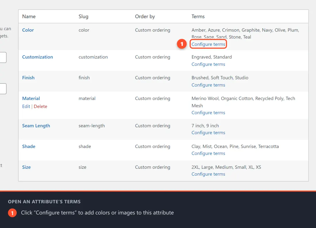
You are now on the Terms screen for that attribute. This works exactly like WordPress tags or categories. You will see existing terms on the right and a form to add new ones on the left.
Step 4 — Add a New Term with a Swatch
Let's add a color called "Midnight Black" with a black color swatch.
- In the Add new Color form on the left, fill in:
- Name:
Midnight Black - Slug: leave it to auto-fill
- Name:
- You will now see new swatch fields added by the plugin:
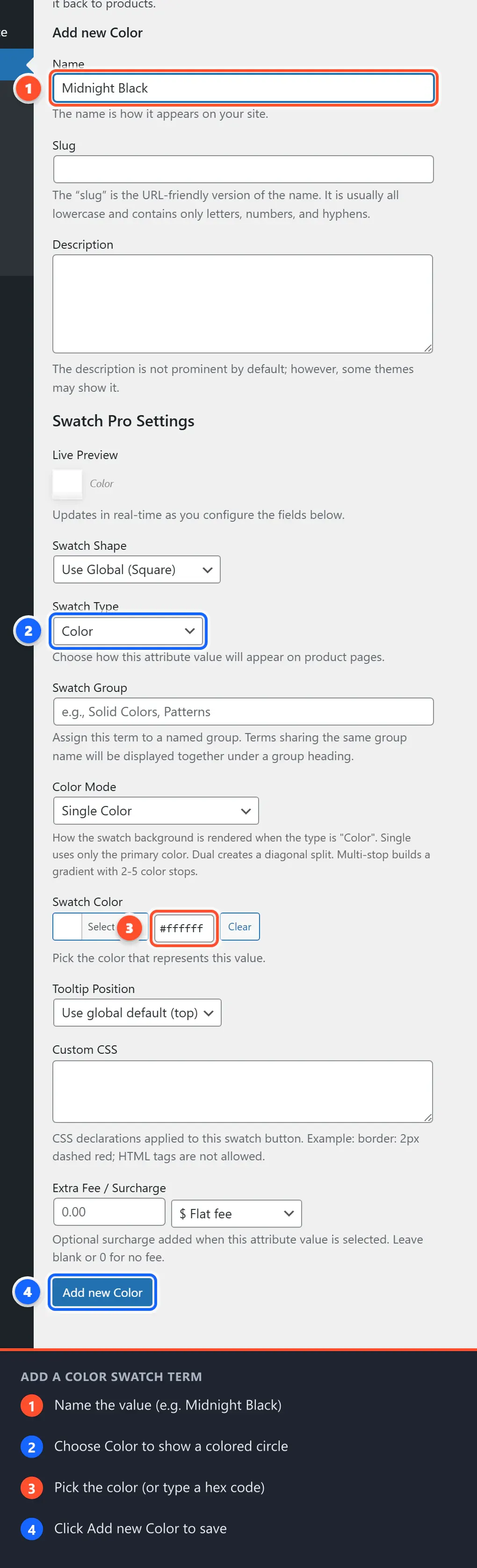
The Swatch Fields
Swatch Type
This is a dropdown with five choices:
| Option | What it Does |
|---|---|
| — Select type — | No swatch — the term will appear as a plain text pill |
| Color | Shows a filled circle (or square) in the color you pick |
| Image | Shows a small photo or texture you upload |
| Text Label | Shows the term name as a styled label button |
| Radio Button | Shows a classic radio control next to the term name |
Select Color for this example.
A color picker will appear beneath it.
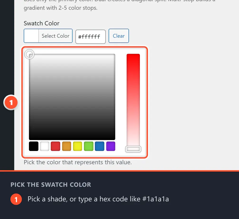
Swatch Color (shown when "Color" is selected)
Click anywhere inside the color picker swatch box. A color palette will pop up. You can:
- Click a color in the color wheel
- Type a hex code directly into the text box (for example,
#1a1a1afor near-black) - Use the sliders to pick the exact shade you want
For "Midnight Black", type #1a1a1a or drag to a very dark shade.
Swatch Image (shown when "Image" is selected)
If you chose Image as the swatch type, you will see a Choose Image button instead of the color picker.
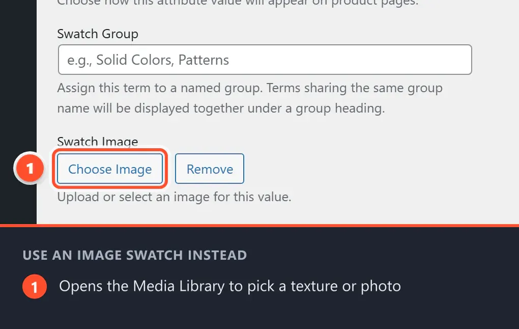
- Click Choose Image.
- The WordPress Media Library will open — the same place you upload photos for blog posts.
- Select an existing image, or click Upload Files to upload a new one.
- Click Use Image.
A small preview thumbnail will appear confirming your selection. You can click Remove at any time to change it.
Tip for image swatches: Keep swatch images square and small (around 100×100 pixels). Textures, fabric swatches, and pattern thumbnails work great here.
- After filling in the swatch fields, click Add new Color at the bottom of the form.
Your new term "Midnight Black" will appear in the terms list on the right side, with a small preview of its swatch in the Swatch column.
Step 5 — Edit an Existing Term
To update a term you have already created:
- Hover over the term name in the list on the right.
- Click Edit below it.
- You will see the same Swatch Type, Swatch Color, and Swatch Image fields.
- Make your changes and click Update.
Step 6 — Add All Your Terms
Repeat Steps 4–5 for every color (or size, or scent, etc.) you offer. For example, a "Color" attribute for a skincare range might look like:
| Term | Swatch Type | Color / Image |
|---|---|---|
| Rose Blush | Color | #e8b4b8 |
| Ivory Cream | Color | #f5f0e8 |
| Midnight Black | Color | #1a1a1a |
| Lavender Mist | Color | #c9b8d8 |
| Natural (texture) | Image | [fabric photo] |
What Happens if I Don't Set a Swatch Type?
That is perfectly fine! If you leave Swatch Type set to "— Select type —", the term will still appear as a button on your product pages — it just shows the term's name as a text label (called a text pill). This is useful for "Size" attributes where colors don't make sense.
The Swatch Preview Column
On the Terms list screen, notice the Swatch column. It shows:
- A colored circle preview for color swatches
- A small thumbnail for image swatches
- A dash (—) for terms with no swatch type set
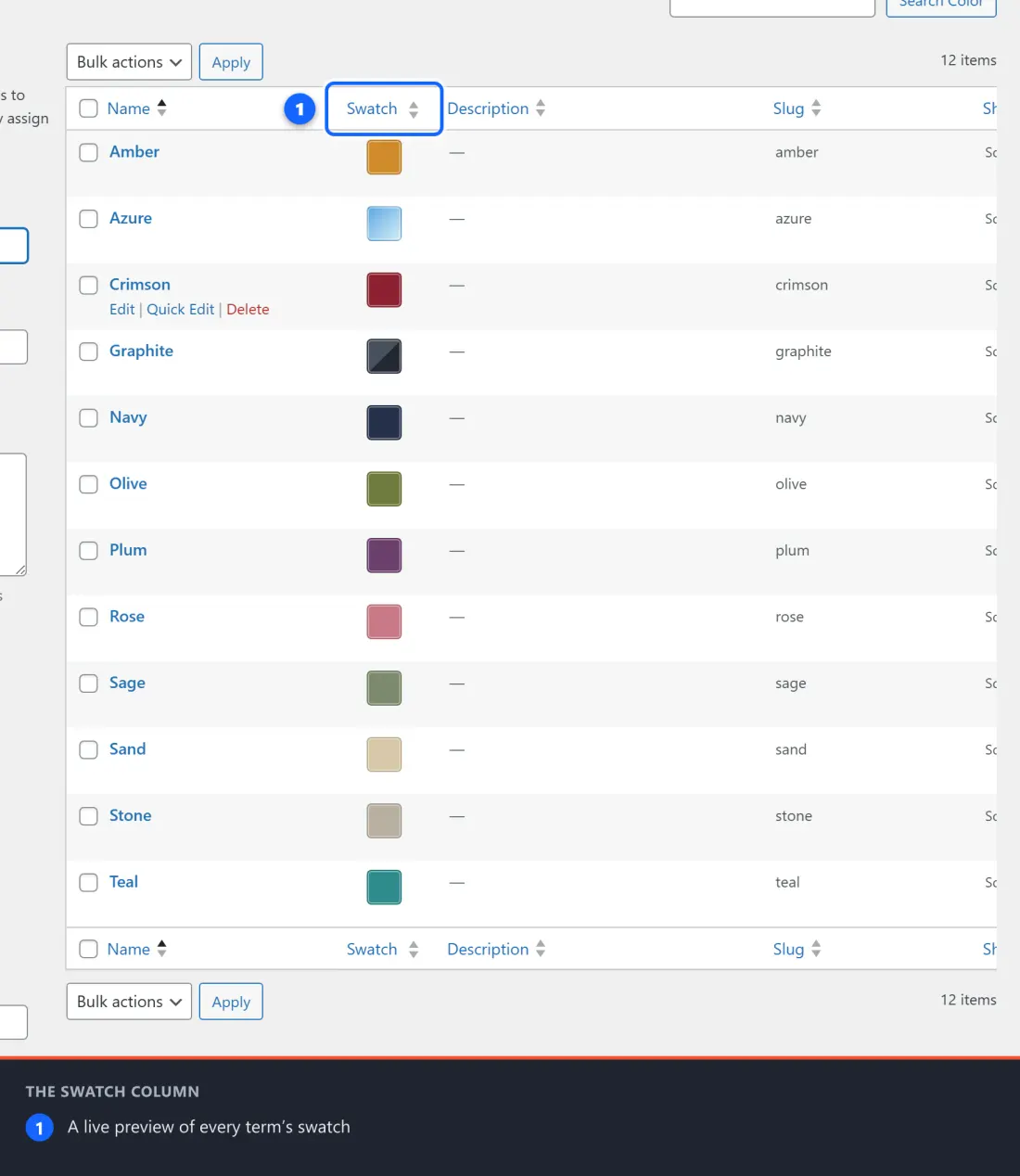
This lets you quickly confirm all your terms are configured before going to your products.
Repeat for Other Attributes
If you also have a "Size" attribute, go back to Products → Attributes, click Configure terms on "Size", and add your sizes (XS, S, M, L, XL, etc.). You don't need to assign colors to size terms — they will appear as text pills, which is completely normal.
Want to Add Gradients, Shapes, or Tooltips?
Once you have set up your attribute terms here, two Pro modules let you go further:
- The Advanced Styling module — replace flat colors with multi-stop gradients (blend up to 5 colors on a single swatch) and change the shape of individual swatches (circle, square, pill, or custom)
- The Swatch Tooltips module — add hover tooltips that show the color name when a customer mouses over a swatch
These are configured per-term on the same edit screens you just used. See Chapter 9 — Advanced Styling for step-by-step instructions.