
Chiseiko Essential Swatches
Chiseiko Essential Swatches Settings
Everything you have set up so far — attribute swatches and variable products — works the moment you save it. This chapter covers the store-wide settings that control how those swatches look and behave across your shop. These settings ship with the free plugin: you do not need Pro to use any of them.
You will find the settings page under:
WooCommerce → Settings → Chiseiko Essential Swatches Settings
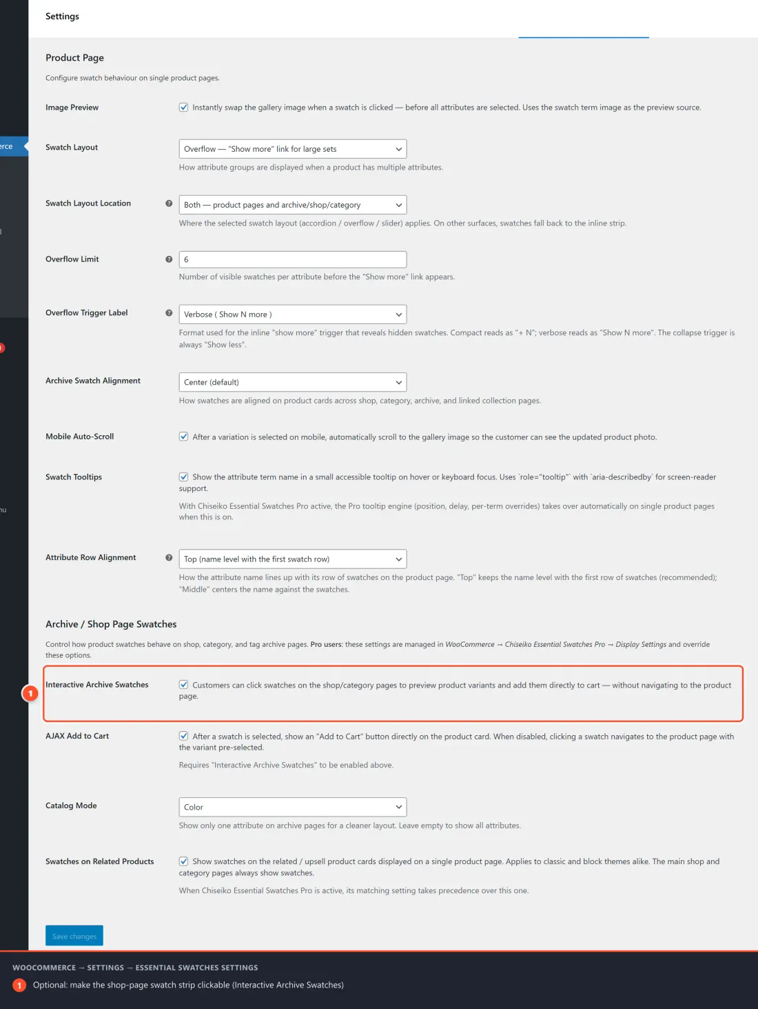
The page has two sections: Product Page (how swatches behave on a single product) and Archive / Shop Page Swatches (how swatches behave on shop, category, and archive grids). After changing anything, scroll to the bottom and click Save changes.
Already using Pro? Several of these options are taken over by Pro modules when Pro is active — each setting below notes when that happens. With Pro installed, the matching controls live under WooCommerce → Chiseiko Essential Swatches Pro.
Section 1 — Product Page
These options control swatches on the single product page (the page a customer lands on when they open one product).
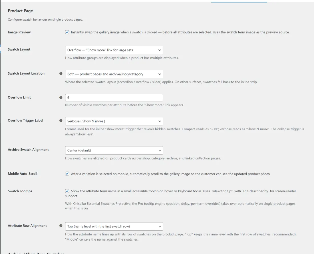
Image Preview
Default: On.
When a customer clicks a swatch, the main product gallery image swaps instantly to that variant's image — even before they have picked every attribute. The preview uses the swatch term's image (the image you set on the attribute term) as its source.
- What it affects: the product gallery on single product pages. Customers get immediate visual feedback the moment they touch a swatch, instead of waiting until a full variation is resolved.
- Turn it off if you want the gallery to change only when WooCommerce resolves a complete variation (all attributes selected).
Swatch Layout
Default: Inline.
Controls how attribute groups are arranged when a product has multiple attributes (for example Color and Size). Four choices:
| Layout | What it does |
|---|---|
| Inline (default) | Every swatch in an attribute shows in a single wrapping row. Simple and predictable. |
| Accordion — collapsible groups | Each attribute becomes a collapsible panel. Good for products with many attributes where vertical space is tight. |
| Overflow — "Show more" link | Shows a limited number of swatches per attribute, then a "show more" trigger reveals the rest. Best when one attribute has many values. |
| Slider — left/right arrows | Swatches sit in a horizontal track with arrow navigation. Keeps long attribute rows on a single line. |
- What it affects: the visual arrangement of swatch groups. It does not change which variations exist — only how the buttons are presented.
The "Inline" layout always renders on every surface, regardless of the Swatch Layout Location setting below. The accordion, overflow, and slider layouts only apply where you allow them.
Swatch Layout Location
Default: Both.
Decides where the layout you picked above (accordion / overflow / slider) actually applies. Anywhere it does not apply, swatches fall back to the plain inline strip.
| Option | Where the chosen layout applies |
|---|---|
| Both | Product pages and archive / shop / category grids |
| Product pages only | Single product pages only; archives stay inline |
| Archive / shop / category / collection only | Archive grids only; product pages stay inline |
- What it affects: lets you, for example, use a compact slider on crowded shop cards while keeping the roomy inline strip on the product page.
Overflow Limit
Default: 8. (Only applies when Swatch Layout is set to Overflow.)
The number of swatches shown per attribute before the "show more" trigger appears. A product with 20 colors and a limit of 8 shows eight swatches and a trigger that reveals the remaining twelve.
- Range: 1–50.
- What it affects: how much vertical space a large attribute takes up before the customer chooses to expand it.
Overflow Trigger Label
Default: Compact. (Only applies when Swatch Layout is set to Overflow.)
The wording of the inline "show more" trigger that reveals the hidden swatches:
- Compact reads as
+ N(e.g. "+ 12"). - Verbose reads as
Show N more(e.g. "Show 12 more").
The collapse trigger is always "Show less".
- What it affects: purely the label text on the expand trigger — choose whichever reads better with your theme.
Accordion Mobile Only
Default: On. (Only applies when Swatch Layout is set to Accordion.)
When on, attribute groups collapse into an accordion only on mobile viewports (under 768px wide). On desktop they display inline.
- What it affects: keeps long product pages compact on phones while leaving the desktop layout open and scannable. Turn it off to use the accordion on every screen size.
Archive Swatch Alignment
Default: Center.
How the swatch strip is aligned on product cards across shop, category, archive, and linked collection pages — Left, Center, or Right.
- What it affects: only the horizontal alignment of swatches under each product card. Pick the option that lines up with how your theme aligns product titles and prices.
Mobile Auto-Scroll
Default: On.
After a customer selects a variation on mobile, the page automatically scrolls up to the gallery image so they can see the updated product photo without scrolling manually.
- What it affects: the post-selection scroll behavior on phones. On a long product page, the gallery is often above the fold of swatches; this brings the new image into view. Turn it off if your theme already keeps the gallery visible.
Swatch Tooltips
Default: On.
Shows the attribute term's name in a small, accessible tooltip when a customer hovers or keyboard-focuses a swatch. The tooltip uses role="tooltip" with aria-describedby, so screen readers announce it too.
- What it affects: accessibility and clarity — customers can confirm "Midnight Black" vs "Navy" without guessing from the color alone.
With Chiseiko Essential Swatches Pro active, the Pro tooltip engine (custom position, hover delay, per-term overrides) automatically takes over on single product pages while this setting is on. See Chapter 9 — Advanced Styling and the Pro tooltips module.
Attribute Row Alignment
Default: Top.
How an attribute's name lines up vertically against its row of swatches on the product page:
Top — the name sits level with the first row of swatches (recommended).
Middle — the name is vertically centered against the whole block of swatches.
What it affects: the vertical alignment of the attribute label (e.g. "Color:") relative to its swatches. "Top" reads best when an attribute wraps onto multiple rows.
When Chiseiko Essential Swatches Pro is active, its matching setting takes precedence over this one.
Section 2 — Archive / Shop Page Swatches
These options control swatches on shop, category, and tag archive pages — the grids that list many products at once.
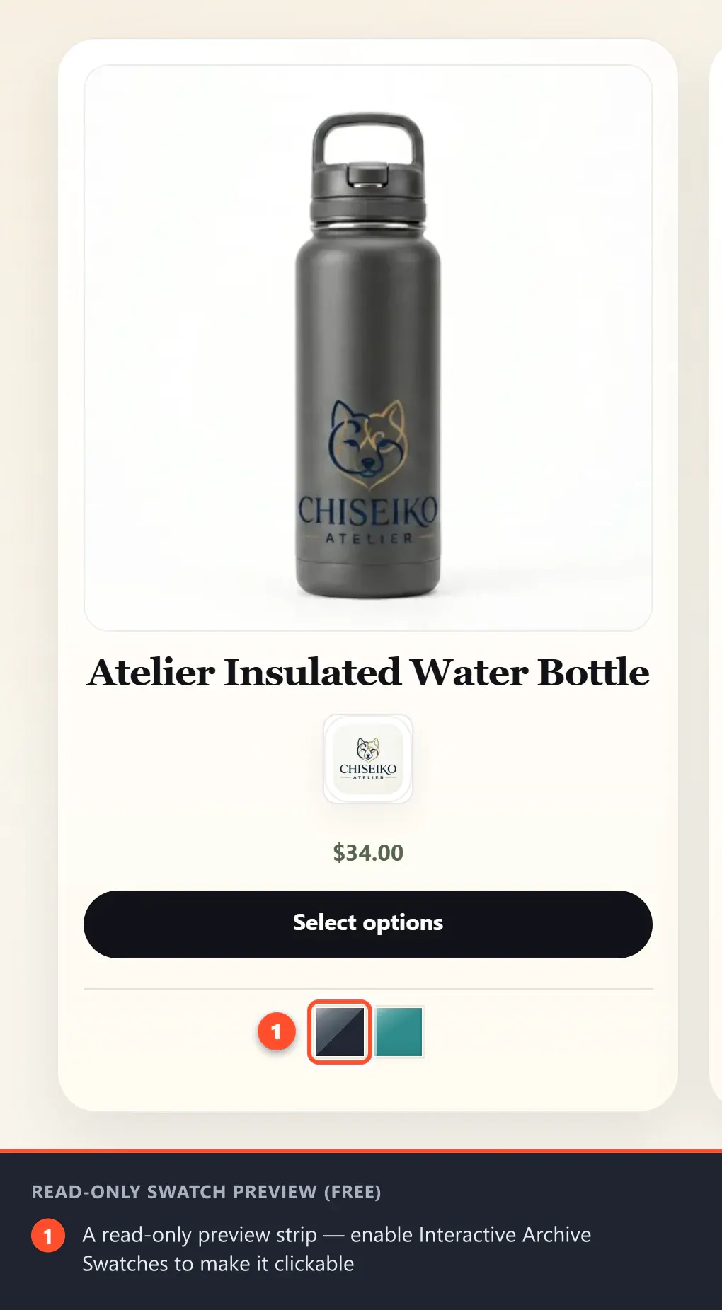
By default, swatches on archive pages are a read-only preview strip under each product card: customers see the available options at a glance but click through to the product page to choose. The settings below let you make that strip interactive.
Pro users: these options are managed in WooCommerce → Chiseiko Essential Swatches Pro → Archive Swatches, and the Pro module overrides the free settings here. See Chapter 7 — Interactive Archive Swatches.
Interactive Archive Swatches
Default: Off.
Turns the read-only archive strip into clickable swatches. With it on, customers can preview a variant's image directly on the product card and (optionally) add it to the cart without ever opening the product page.
- What it affects: shop, category, and archive grids become shoppable. This is a real conversion feature in the free plugin — not a Pro-only capability.
- When this is off, archive swatches stay as a non-clickable preview.
AJAX Add to Cart
Default: On. (Requires Interactive Archive Swatches to be enabled above — this field only appears once that toggle is on.)
Decides what happens after a customer selects a swatch on a product card:
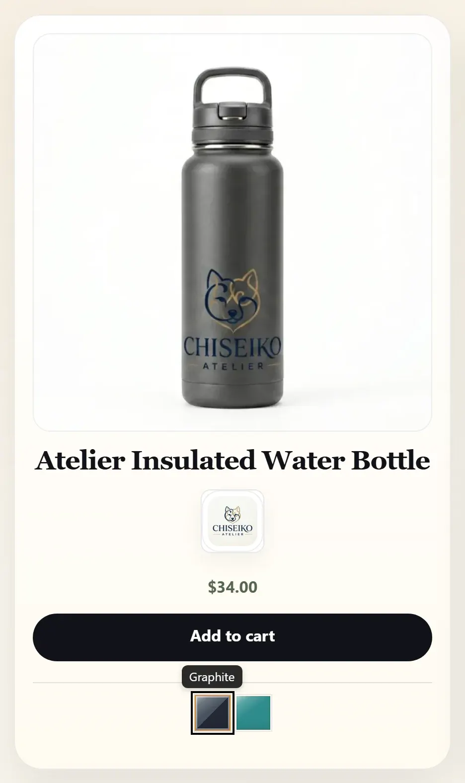
On (default): an Add to Cart button appears right on the card, so the customer adds the chosen variation straight from the shop grid.
Off: clicking a swatch sends the customer to the product page with that variant pre-selected for them.
What it affects: whether the shop grid supports true add-to-cart-from-archive, or acts as a faster path into a pre-configured product page.
Catalog Mode
Default: Show all attributes.
Lets you show only one attribute on archive cards for a cleaner grid. Choose an attribute from the dropdown (the list is built from your WooCommerce global attributes), or leave it empty to show every attribute.
- What it affects: how much swatch detail appears under each card on shop/archive pages. A store whose products vary by Color and Size might show only Color on the grid to keep cards tidy, while the product page still offers both.
Swatches on Related Products
Default: On.
Shows swatches on the related / upsell product cards that WooCommerce displays at the bottom of a single product page. Works on both classic and block themes.
- What it affects: only the related/upsell strip on product pages. The main shop and category pages always show swatches regardless of this setting.
When Chiseiko Essential Swatches Pro is active, its matching setting takes precedence over this one.
How These Settings Work Together
A few interactions are worth keeping in mind:
- Inline is always available. No matter what you pick for Swatch Layout or Swatch Layout Location, the inline strip renders everywhere as the fallback. You never end up with "no swatches".
- Conditional fields appear and disappear. Some fields only show when a related setting is active, so the page stays uncluttered:
- Overflow Limit and Overflow Trigger Label appear only when Swatch Layout = Overflow.
- Accordion Mobile Only appears only when Swatch Layout = Accordion.
- AJAX Add to Cart appears only when Interactive Archive Swatches is on.
- Pro takes the wheel where noted. Tooltips, attribute-row alignment, related-product swatches, and the whole archive section are handed to the equivalent Pro module when Pro is active — the free values act as the baseline until then.